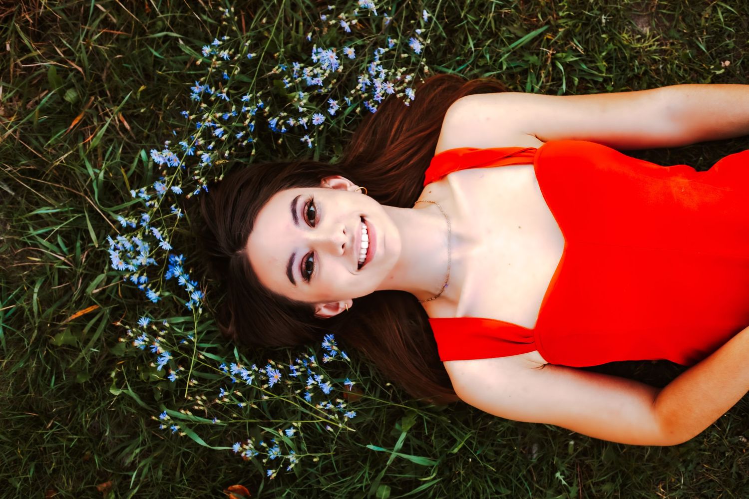
The Outfits are Everything
What makes your photos tell the story of your family, while also looking like my art?
First is the timing - I usually shoot outdoors in the late afternoon or evening for the best lighting.
Then, it's your family's love & joy.
Last, but certainly not least, is the clothing you wear.
The colors, the fit, the textures - it all matters more than you would ever think!
This guide will help you choose what colors to use and what colors to avoid- as well as how to mix and match textures and patterns to get the best outcome.
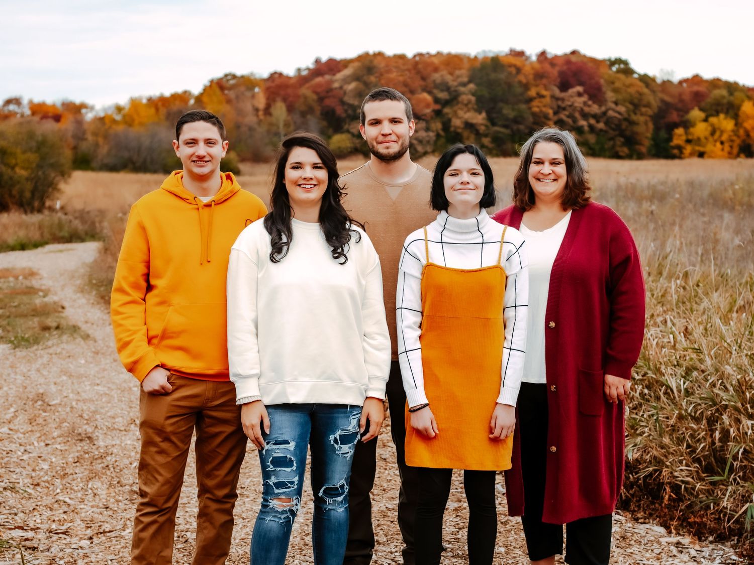
Everyone should coordinate but not match -
No one should be wearing the same two exact colored items or having kiddos in
the exact same matching outfit. Colors that coordinate with each other end up looking much better in photos! Olive & mustard coordinate, for example. I like neutrals for this reason. A cream-colored sweater/dress/shirt can complement just about anything! More on color later in this guide.
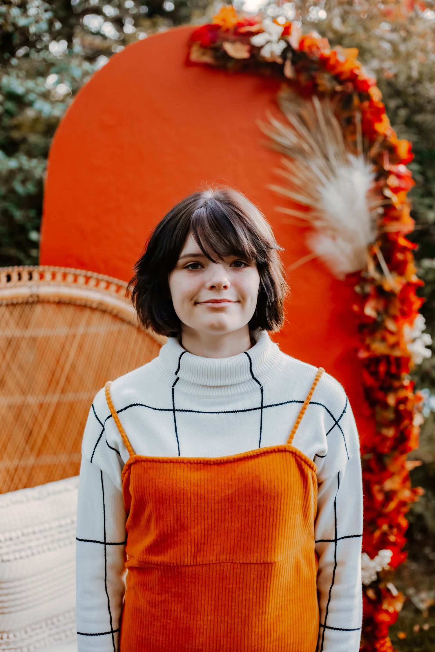
You can mix & match textures, patterns, and solids -
Throw in a good mix of patterns/solids. It's important not to use any patterns that are too busy (ex, thin stripes or polka dots will overwhelm the picture). Thick stripes would be a better choice.
Textures bring variety too. Jeans (rips and all!) can bring nice texture in; same with chunky sweaters.
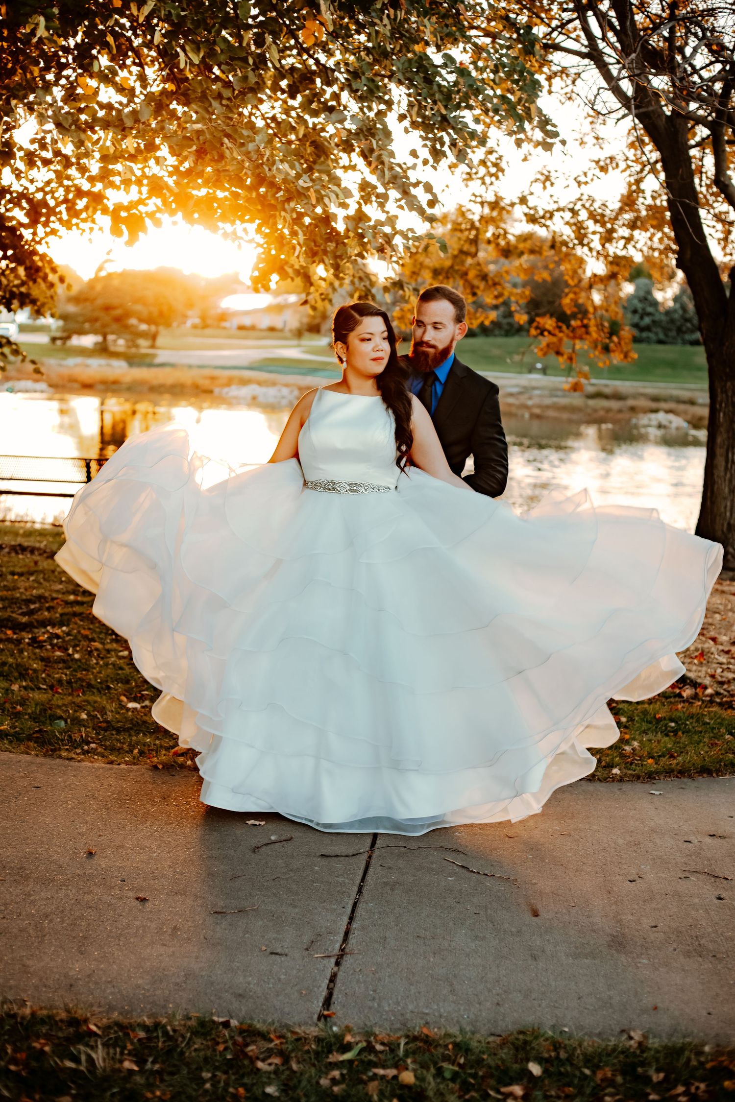
Movement is a
HUGE bonus-
Mom this tip is for you! I want you able to move comfortably and I also like your outfit to have some flow so we can capture movement as you play with your kiddos!
Movement can really help bring a photo to life.
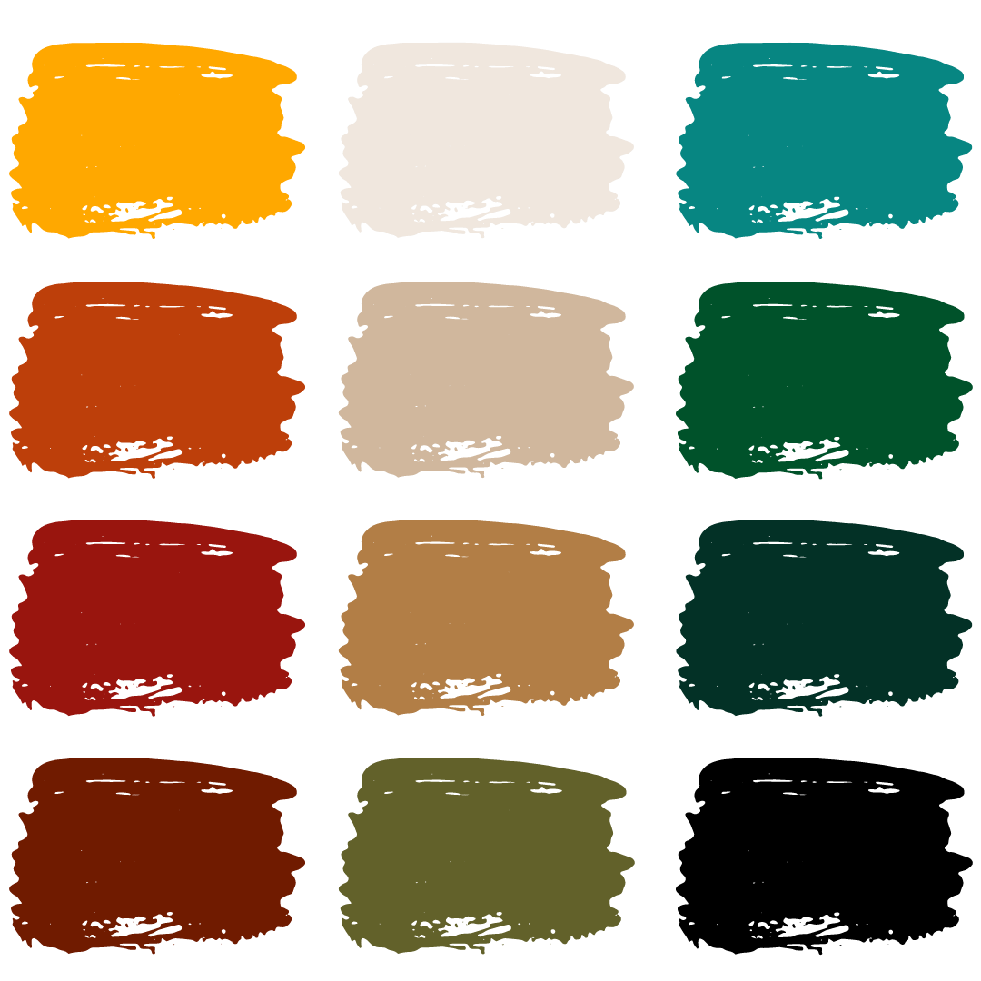
Brand Colors
This is the color pallet that photographs well with my editing style.
Don't worry! If color isn't your thing you don't need to show up dressed to the nines in this color scheme. Feel free to play around with it!
For example, you could stick to neutrals and throw in a few olive-green pieces to keep your color pallet muted.
Or, if you love color, you could use a bunch of these! They all complement each other well so long as you are also using neutral colors. You still need a couple of pieces that tone down the color group so that you can still stand out without being overwhelmed by all of the colors together.
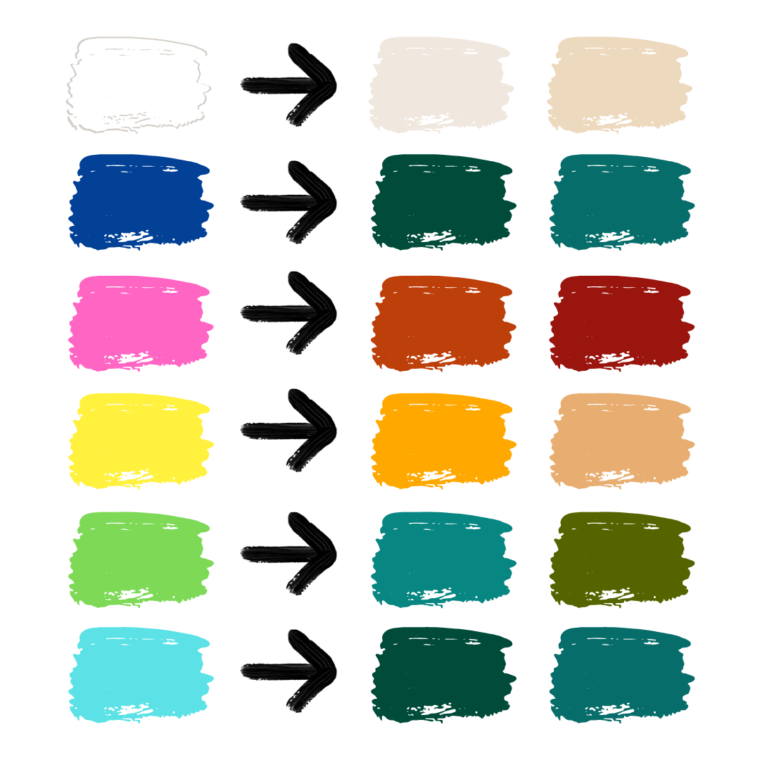
Here are the colors that do not edit well with my style.
Some colors don't work well with my style and how I prefer to edit, this section will help you avoid them and choose a great alternative!
White- Very light cream or tan works better but white is doable!
-
Navy- wear teal, emerald, or olive instead
Pink- wear rust or maroon
Bright yellow- wear tan or mustard
Bright green- wear olive, emerald, or a deeper green
Light blues- switch to something with more depth, like teal
-(Jeans are always welcomed!)
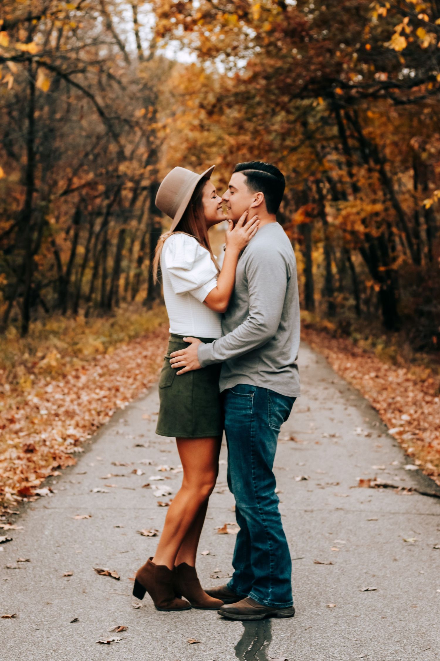
Let's talk accessories
Photos are an occasion that is SPECIAL and you should celebrate it as such. Go all out! When else will you?
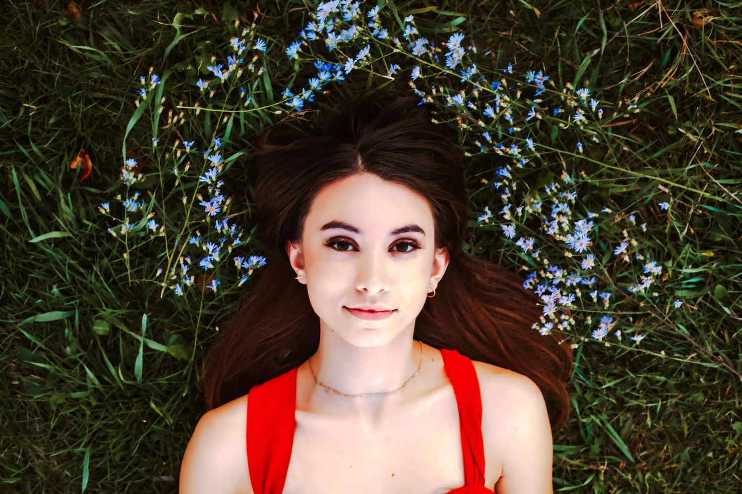
Moms- use it as a time to get your hair/makeup and nails done. Those details are an amazing touch.
Wear accessories that make you feel pretty- hats, belts, not everyday jewelry etc.
Layer up with flowy cardigans, or an off-the-shoulder piece, you can always choose not to use it!
For kids- flower crowns, tall socks, small non-distracting bows, beanies, and suspenders are all great options!
Go neutral on the shoes as well- black or brown booties/sandals etc.
Final checklist!
- Avoid wearing daily accessories like apple watches
- Girls- check wrists for hair ties & remove
- Dads- remove pockets of cell phone/wallet/keys
- Wear a bra that won't show or need adjustments
- Try to avoid having your child bring a toy that is hard to part with it during photos
- If your baby/toddler uses a pacifier, a neutral-colored option can help it blend during the shoot.
Please text me your outfits if you'd like feedback! I love to look and can even help you style your whole family.


